Accessibility
"Accessibility" may also refer to accessible design of transit vehicles and stations to provide mobility for all, including people with disabilities.
In this article, accessibility (or just access) refers to the ability to reach goods, services, activities, and destinations, which together are called opportunities.[1]
Accessibility is nearly always measured by how long it takes to reach destinations, or rather how many destinations can be reached within a certain amount of time. However, different tools and evaluations vary in the way they measure first and last mile, the types of destinations they include, population segmentation analysis, and the mechanisms used for counting destinations.
Accessibility vs. Mobility
Transit systems have been increasingly focused on accessibility when evaluating their systems and new projects. Although accessibility has always been a chief goal of transit, past measures have tended to focus on mobility, looking at the number of people who can access the transit system, system capacity, and line speeds. While improvements in service strengthen the transit system, these measures do not evaluate whether people have access to important destinations. Fast transit lines reaching many may nevertheless fail to connect people to job centers, grocery stores, or schools. Far reaching transit systems may force multiple transfers to reach a destination, such that the trip becomes unreasonably long. Accessibility directly addresses these questions by measuring people's ability to reach desired destinations.
Decay vs. Cut-offs
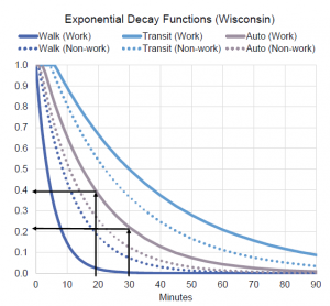
One major distinction in measuring accessibility is how parameters are set for determining whether a destination is accessible. One method is to create a time cut-off. For example, one can ask "how many jobs can be reached in 30 minutes using transit from a given location?" or "how many household/job combinations are there within 30 minutes of each other along a transit line or within a transit system?" The alternative is to use a decay function. A decay function weights destinations based on how far they are, so that farther locations are given less weight than closer ones.
Time cut-off
Time cut-offs are useful because they are slightly easier to calculate. Some tool is needed to figure out how far one can go on a system in the specified amount of time, and then all points corresponding to a destination within that area are counted up. They also tend to be easier to communicate to the public or to decision makers. 10,000 jobs accessible in 30 minutes from a given area, or a new line or faster service increasing the number of jobs available in 30 minutes of travel is a relatively easy idea to understand. Time cut-offs suffer a few disadvantages however. A large employment center just outside of the time range is completely disregarded. So if there are 1,000 jobs available in 30 minutes but 2,000 jobs available in 31 minutes, the analysis will ignore the jobs just outside the cut-off and yield misleading results. Cut-offs also fail to discriminate between where destinations are located within a region. For example, this type of analysis will provide the same results if all of the jobs are five minutes away or thirty minutes way, although being five minutes away clearly provides better access. Some of these disadvantages can be overcome by conducting multiple analyses with different cut-offs, such that instead of having one number for a certain distance, one can observe the change as travel time increases.
Decay

Decay functions offer a more fine-tuned assessment of accessibility by weighting destinations based on how far away they are. A job that is 5 minutes away contributes more to accessibility than one that is 30 minutes away, and a job that is 30 minutes away contributes about the same as one that is 31 minutes away. Decay functions usually have a cut-off, somewhere around the 60 to 90 minute mark, where destinations are considered so inaccessible that they no longer contribute to accessibility at all. Using decay is challenging for a number of reasons. A meaningful and reliable decay function has to be developed. The computational effort of calculating the exact travel time to each location and weighting the location is intense and often slow. Finally, because locations are weighted, the final output is unit-less; it cannot be explained as the number of jobs within a 30 minute travel time window. This may allow for internal comparisons but may be difficult to convey conceptually at public presentations. One solution to improve presentation is to develop a clear scale and to create references as explanations for various points on the scale. (ex. a 1-100, where 80-100 is considered "excellent accessibility", etc.)
First and Last Mile
First and last mile is a common expression referring to how people get to a transit station, and how they get from transit to their destination. These considerations recognize that the time it takes to travel by transit is broken up into four pieces: Travel to the station, waiting at the station, travel on transit, and travel to a destination. More complicated trips may include other elements such as waiting for a transfer, or traveling between stations to transfer. Some tools only look at travel time between stations, with the possible inclusion of wait time (usually calculated as half of headway). In that case they use circular buffers to determine which populations and destinations are within a certain distance of stations and therefore considered accessible. Other tools incorporate travel time to and from the stations by using circular buffers and calculate an average travel time to the station within the buffer, or by calculating travel time on the street network.
Buffers
For a quick and relatively simple analysis of who has access to the transit stop, circular buffers can be drawn around them, capturing households and destinations. A standard size for buffers is 1/4 mile radius for bus stops and 1/2 mile radius for LRT or BRT. Drawing buffers offers quick analysis, but has some disadvantages. People or destinations just outside the buffer may be unnecessarily excluded. Buffers measure distance on a map, so barriers such as highways or railroad tracks are ignored, meaning some people are included that have no access to the stations, or for whom the station is much farther away than the 1/4 or 1/2 mile measured. When buffers are used, travel time can be estimated as an average. For example, one could say that people inside of a 1/2 mile buffer around a light rail station take 7 minutes on average to get to the station. This helps establish realistic accessibility expectations, but glosses over the fact that some people in the buffer only have a 1 minute walk to the station, while others might have a 12 minute walk, which drastically changes their total travel time.
Using the street network
Some tools use the street network to estimate travel time between origin or destination and the transit station. This calculation can much more accurately determine the first mile and last mile travel time and therefore yields a more accurate total travel time. It avoids the pitfalls of cutting off people or destinations just outside of a buffer and effectively recognizes relative distances from stations. However, it requires an individual calculation from each origin to each destination, rather than preforming calculations only between stations, hence a much more computationally intensive process. It also requires an accurate street network that includes pedestrian paths.
Destinations
Accessibility analysis measures how long it takes to arrive at certain types of destinations. The most common destination measured is jobs. Access to jobs is crucial for employers and employees and to maintain a robust economy. Peak commute hours tend to be the most congested times of the week, so increasing accessibility to jobs via transit is particularly important when seeking solutions to congestion. Data sources for jobs are also easy to acquire through the publicly available LODES and LEHD data. Other destinations are also often sought. These can include restaurants, grocery stores, schools, health facilities, parks, etc. Accessibility to these types of amenities has a serious impact on quality of life, and is therefore important in evaluating transit effects on a community. Since only 20% of trips are for a home-to-work commute[3], factoring other trip destinations has a significant impact on how much people will use a transit system. There are no government generated sources for these databases. Some tools use open source options, such as OpenStreetMap, while other acquire proprietary databases. A challenge when working with other destinations is how to group them or weight them. Analyzing accessibility to grocery stores might be relatively easy (although even in this example, classifying grocery stores might be difficult). However, analyzing accessibility to amenities broadly raises questions of which amenities count and which amenities are most important.
Population Analysis
In order to address equity issues and to comply with Title VI, accessibility measurements seek to display how accessibility will change for different segments of the population. This can include relative effects on low-income households, different racial minorities, people with disabilities, households without cars or with fewer cars than workers, among others. Demographic data can be fairly easily acquired in the US through the Census and/or ACS. A simple visual analysis layers a demographic map and an accessibility map. A more complicated analysis would actually calculate the changes in accessibility to census blocks or block groups of varying demographic characteristics and measure relative effects.
Example Tools
Some tools that measure accessibility are discussed below
- Sugar is a tool offered by Citilabs. It measures access using decay functions, creating an access score. Sugar incorporates first and last mile travel on a the pedestrian street network in measuring its total travel time. It offers accessibility measures to many types of destinations using destination data from navigation company HERE and allows for custom weighting of destination types. Sugar allows for easy layering of demographic data, but does not include demographic based calculations.

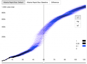
- Transport Analyst offered by Conveyal is an open source tool. It offers accessibility information for various cut-off points and creates spectrograms that show the change in accessibility as travel time increases, but does not create a related score. Analyst offers accessibility measures for a number of different destination types, acquired from OpenStreetMap, and allows for demographic overlays.
- TBEST is a tool mostly used for estimating transit boardings that was developed by FDOT. TBEST includes an accessibility analysis function, but it is limited in destination options, and only calculates stop to stop travel times.
Further Reading
- "The Why and How of Measuring Access to Opportunity: A Guide to Performance Management." Governors’ Institute on Community Design. January 2017. http://www.govinstitute.org/wp-content/uploads/2017/01/how-and-why-of-measuring-access-to-opportunity.pdf
- "Accessibility in practice: A guide for transportation and land use decision making" Sundquist, Eric, Chris McCahill, and Logan Dredske. State Smart Transportation Initiative. October 2017. https://www.ssti.us/wp/wp-content/uploads/2018/01/Accessibility_Guide_Final.pdf
.
References
- ↑ "Accessibility for Transportation Planning: Measuring People’s Ability to Reach Desired Goods and Activities." 27 February 2017. Todd Litman. Victoria Transport Policy Institute. http://www.vtpi.org/access.pdf
- ↑ "Operationalizing Accessibility: Tools and Practices." State Smart Transportation Initiative. 30 March 2017. http://www.ssti.us/Events/operationalizing-accessibility-part-1-tools-and-practices/
- ↑ "Commuting in America 2013: The National Report on Commuting Patterns and Trends." American Association of State Highway and Transportation Officials. http://traveltrends.transportation.org/Pages/default.aspx
- ↑ Conveyal analysis-ui documentation. Accessed 20 April 2017. http://analysis-ui.readthedocs.io/en/latest/analysis/#spectrogram